 Sometimes imaging software by default enables us to create beautiful visualizations. However, designing visualizations that are readable and provide key insights is much more difficult. As visualization designers, we are “melding the skills of computer science, statistics, artistic design, and storytelling” (Cukier, 2010, para 3).
Here are 3 tips to create a story through your visualizations:
1. Provide a clear takeaway for each visualization.
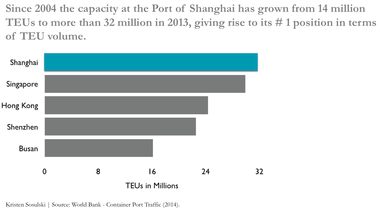
To ensure a clear takeaway for each visualization, write the takeaway in the notes, or as the title of the slide. For example, see the visualization below. It clearly notes why these Asian cities are plotted on the y-axis.
2. Put the findings in context.
Without context, data is meaningless. Not only is context important, providing a clear context for your findings is crucial. What does 100k in sales translate to? Is that over one hour, day, week, month, quarter, or year? How does this data compare to this time last year? In the example below, an insight is communicated that puts the # position (Shanghai) in context and provides an explanation for the rise to the top.
3. Present the key numbers .
It is important to summarize the key findings and present the numbers in a meaningful context that is comprehensible to the audience.
For example, it may be more helpful to show a percentage change from year to year when presenting an increase over time, rather than with absolute numbers. Specifically, if the core point is to compare the change from year to year, percentage change is an effective metric.
By incorporating these tips you can tell better stories with data and use your visualizations to reveal important insights about the data. See the full SlideShare presentation below.
Do you have any questions? Leave them as a comment below or ask me on Twitter.
Kristen Sosulski is an Associate Professor of Information Systems and Director of Education for the W.R. Berkley Innovation Lab at NYU Stern School of Business.


