The late Hans Rosling has been an inspiration to me and millions of others because of his passion for using information visualizations to communicate powerful ideas. In tribute, I wanted to share an exercise I created based on Dr. Rosling’s work that I use for my data visualization courses. Public health data is vast, and Gapminder and Hans Rosling have promoted its use to develop knowledge and understandings about our world, the people in it, and how things have changed over time.
The objective of this exercise is for students to experience visualizations. I wanted to put them in the shoes of the audience when given visualizations presented in different formats. I’ll introduce Part 1 of the exercise in this post:

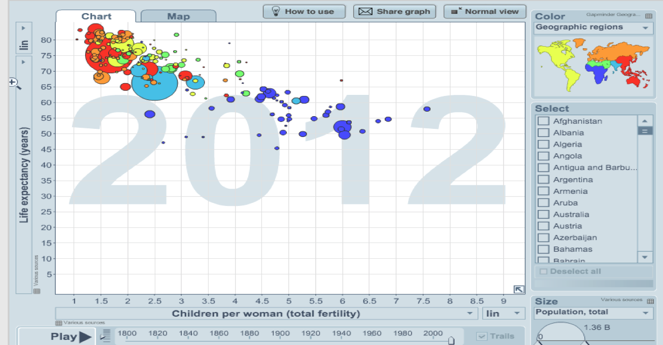
First I give students a paper printout of the chart below, and then I ask them to talk with a neighbor to identify the key takeaway.
To guide the conversation, I ask my students if they can answer the following question:
What’s the relationship between number of children born, and life expectancy in years?
The students are clearly able to see that this static visualization shows the relationship between life expectancy and the children born per woman. However, when I ask them what the relationship is between the two variables, they begin to identify an insight. Specifically, that it looks like life expectancy increases as the number of children per woman decreases.
My next question is:
Does it differ by country?
This starts an interesting conversation. Students agree that it differs by country. I ask them how do they know this? Usually the response is that the bubbles represent countries. Then I ask them what a particular bubble represents, and they are unable to identify the country. The colors provide only the region identification through its color and the visualization’s corresponding legend. My next step is to ask students what the size of the bubbles stand for. They are able to see that size represents population, and many begin guessing which bubbles represent which countries. For example, the students often guess the largest red bubble to be China, and the large aqua bubble as India.
Has it changed over time?
I ask how has life expectancy and fertility has changed over time. This gives students a pause, because they often realize that they are only looking at a single year of data. At this point, they begin to see a limitation of static visualizations.
Continue to Part 2 of this exercise where I introduce students to an animation of the same chart.
Dr. Kristen Sosulski develops innovative practices for higher education as the Director of Learning Sciences for the NYU Stern W.R. Berkley Innovation Labs. She teaches MBA students and executives data visualization, R programming, and operations management as an Associate Professor at NYU’s Stern School of Business.
Kristen’s passion for technology and learning sciences converges in all facets of her career, inside and outside of the classroom. Follower her on Twitter at @sosulski and learn more at https://kristensosulski.com. Stay connected and join her newsletter.