 This is a tutorial for using Adobe Illustrator to edit data visualizations. This was created for my Data Visualization Students at NYU Stern! I provided step by step instructions followed by a video tutorial and demonstration.
Enjoy!
Take a look at this rendering of a chart in R.
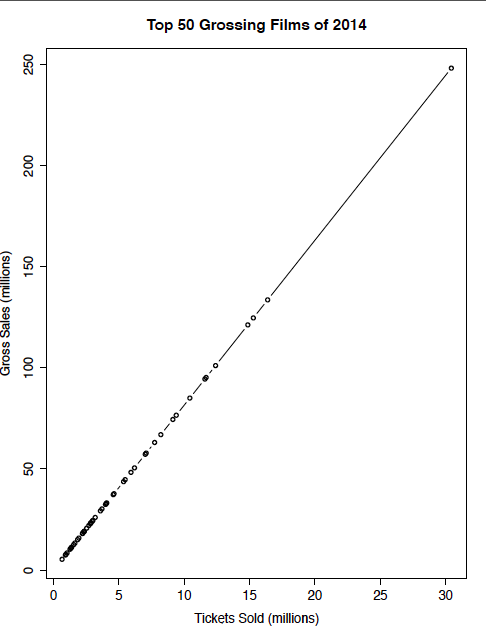
It doesn’t look very good….
This rendered visualization made in R could use a little work. There are many aspects of this chart that violate our design principles.
DESIGN PRINCIPLES
There are many widely accepted design principles that should be applied to your data visualizations. For example, look to reduce chart junk, and aim for readability by using larger font sizes, as well as and horizontal text orientation instead of vertical orientation. Refer to my post on design principles for a comprehensive list of these principles.
Which design principles are violated in the chart presented above?
1) There is a lot of chart junk. This includes both the frame around the chart and the tick marks
2) Readability is impaired. Specifically note the vertical orientation of the text on the y-axis and the use of mixed case lettering.
EDITING CHARTS IN ADOBE ILLUSTRATOR
We can easily remove the borders, tick marks and other chart junk elements. It’s simple to edit text including titles, scales, and the x and y axis labels. Download this PDF file to follow along with my example or work with your own chart.
Step 1. Save your chart as a PDF
Skip this step if you downloaded the file from this tutorial.
You can do this is in RStudio by going to export > Save Plot as PDF.
Step 2. Open PDF document in Adobe Illustrator
Go to File > Open and navigate to your PDF File.
Step 3. Enable the tools window
Look for the Tools window once the file is open. If you don’t see the Tools window, go to the Window menu and click Tools to make it visible.
Step 4. Find the direct selection and selection tools
The white arrow is called the direct selection tool, and the black arrow is called the selection tool. Use the the white direct selection tool to edit content like titles and labels. The black “selection” tool is used to move objects.
Step 5. Remove the clipping mask
Select the black selection arrow. Click and drag it over the image. The border of the images will be highlighted in blue. This is called the clipping mask. Press delete on your keyboard to remove it. If this deletes the graphic, undo your edit, and use the direct selection tool (white arrow) to highlight the clipping mask instead.
Step 6. Remove the border and tick marks
Use the black Selection arrow. Click and drag it over the border. The border appears highlighted. Press delete on your keyboard to remove it. To remove the tick marks, select each tick mark and press delete.
Step 7. Modify the text
Use the white direct selection arrow to click over the text you want to edit. Use the Type > Character window to change the style and size of the font on your chart.
It’s easy to edit your charts in Adobe Illustrator. See the full video tutorial for a demonstration.
You can also download and or view this content as a slide presentation.
NEXT STEPS
The next step is for you to continue working on your chart by adding attribution and a story to your data.
QUESTIONS
Email: [email protected] | twitter: @sosulski
CREDITS
Content created by Kristen Sosulski, Ed.D
Copyright 2016
Special thanks to all the people who made and released these awesome resources for free: Presentation template by SlidesCarnival and Photographs by Unsplash.
Dr. Kristen Sosulski develops innovative practices for higher education as the Director of Education for the NYU Stern W.R. Berkley Innovation Lab. She also teaches MBA students and executives data visualization, R programming, and operations management as an Associate Professor at NYU’s Stern School of Business.
Kristen’s passion for technology and learning sciences converges in all facets of her career, inside and outside of the classroom. Follower her on Twitter at @sosulski and learn more at https://kristensosulski.com. Stay connected and join her #datavis newsletter.